
No. 31 - Design Direction for Xiao Ye
On creating something cozy, unfussy, and fun
So far on this journey, I have shared our restaurant name, our concept, and our floor plan, so now it’s finally time to put my interior design hat on and walk you through the design direction for Xiao Ye! *quick note: If I haven’t personally shared my flat-lays or mood boards with you yet, then you probably have no idea where I’m really taking the design. To be honest, I didn’t either, for a long time.
Before I began designing, I had many questions for myself: What the heck do I want this restaurant to feel like?! What’s the first-generation American aesthetic?! What guiding lights am I going to follow from a design perspective?! AHhhHHHhh! Our super heady restaurant concept didn’t give me very many boundaries to work off of, so I needed to create some for myself. On top of that, designing on your own can be tough and designing for yourself can be just as difficult, so designing for yourself and on your own (AND for the first time!) is next level, dude. 🫠
As I’ve recently honed in on the paint colors and the materials palette for the restaurant, I thought it would be a good time to share the general design direction!


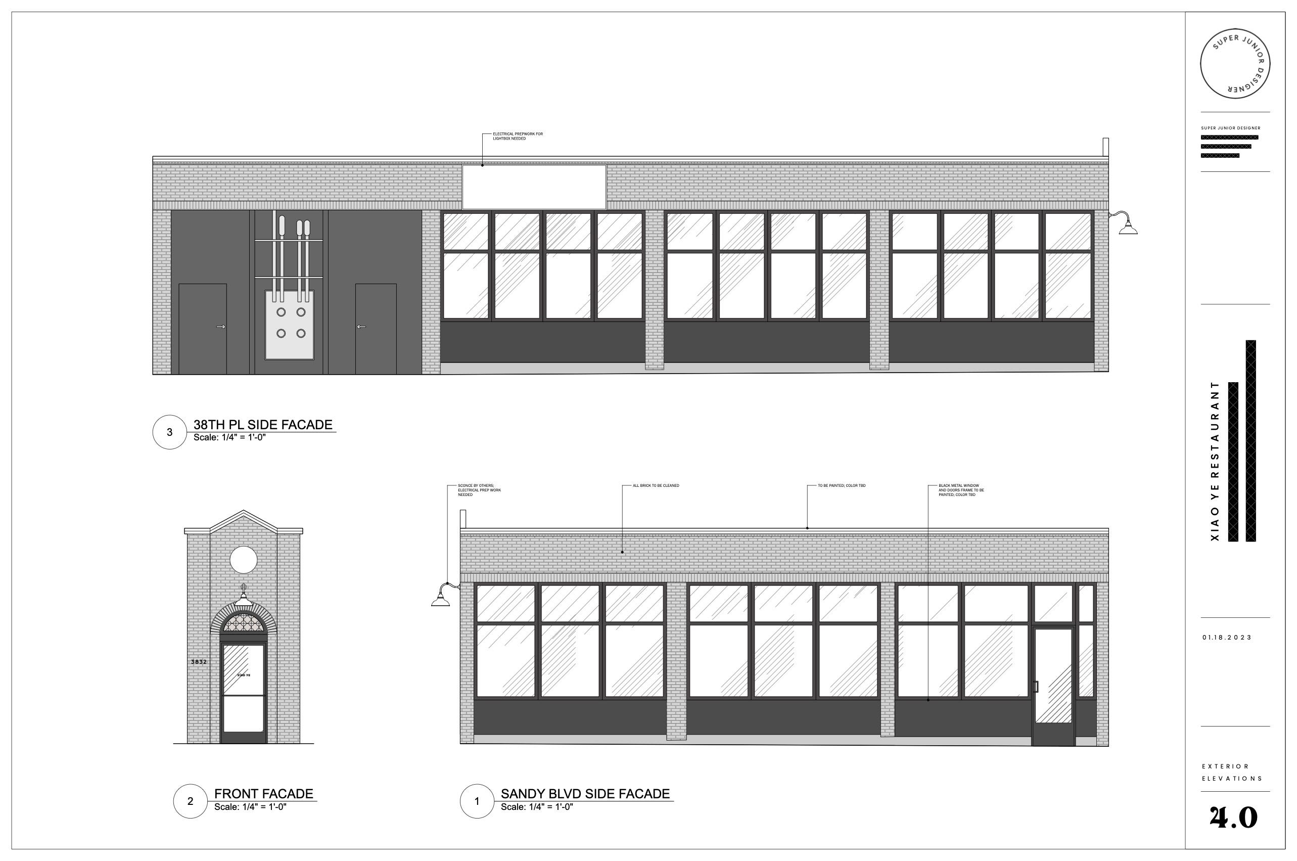
When we were looking for a space, I was really hoping to find one with character; what I was primarily looking for was anything with architectural significance, an indication (big or small) of historic design elements from the past. And even though the interior of our building had ZERO architectural significance, as soon as I saw the brick exterior and front facade, with its arch brick detail and leaded quatrefoil motifs on the glass above the door, I thought to myself, I can work with that! It’s a standalone old brick building with black, metal-trimmed doors and gigantic, modern, sliding windows, and although I would have loved if the windows were a little less modern and huge, I was just excited it wasn’t a concrete box under an apartment building! The brick exterior was a huge selling point for me because it lends itself to that English cottage design I love so much.
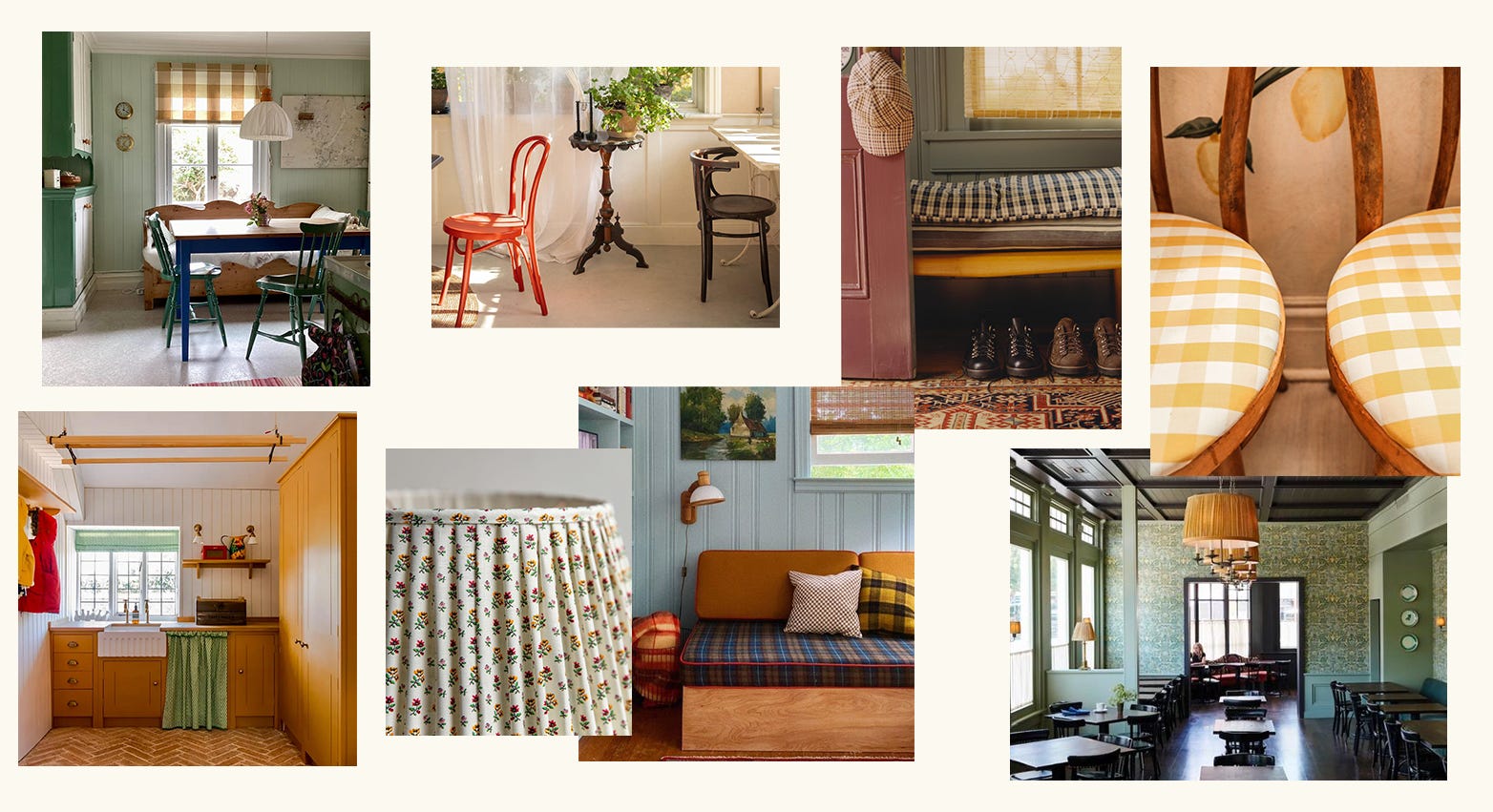
I’ve been lucky enough to have worked under Ginny Macdonald, and she’s exposed me to a lot of English design during my years with her. Thinking about my time with her made me feel better about those big modern windows- I remember her telling me how a lot of English townhomes have these modern extensions with big windows or conservatory-like spaces that look like little jewel boxes in the backyard, so I began looking at English and Brooklyn townhomes for inspiration. It was this starting point that took me down some different design rabbit holes, from combing through Elizabeth Roberts Architecture projects, to religiously watching, what we in our household call, the deVol show, even dissecting the house in the super cheesy movie, Paddington Bear. Surprisingly, the set design in Paddington Bear turned out to be a great example of how I wanted the restaurant to feel like. Cozy, unfussy, and fun.
Those were the three words that kept coming up when we thought about our restaurant. Our service: cozy, unfussy and fun. Our food: cozy, unfussy and fun. Our brand identity: cozy, unfussy, and fun. It only made sense that the design of the space followed suit.

So, there’s really no such thing as the first-gen aesthetic, because it’s so dependent on the individual and their lived experiences. But if there was one, I imagine it being explained very similarly to how we’ve explained what first-generation American food means to us: “it borrows, elaborates, pares down, and encompasses” everything we’ve experienced in our lives. It’s been a real joy being able to use this personal project to experiment with design styles I love and techniques I’ve picked up along the way, and it’s not lost on me how much of a luxury that is, how incredibly rare this opportunity is for any designer to design for themselves and share it with their community. The only time a designer really gets to have their unadulterated vision come to life is if they get to work on their own home, their work studio, or, in my case, their own restaurant. If you couldn’t already tell, I’m using this project as my sandbox and giving myself a chance to really play.

For me, it can be all too easy to get caught up in trends or change the design direction depending on which new rabbit hole I’m going down that week, so it’s super important for me to have some guiding lights to keep me on track.


mix of old and new - incorporating vintage pieces, from the chairs to the interior windows and doors, to keep the space from feeling manufactured and too new!
be creative with inexpensive materials
mismatched is unfussy :)
be bold, be extra, but be under budget lol
pair traditional silhouettes with fun colors
design without fear of what others will think
To cozy up the restaurant, I knew that I needed to be strategic with my millwork and use textiles to soften the space. To keep it unfussy, I decided to focus on the little details that create a lot of impact and not let my designer eye take away “imperfect” quirks. And to make it fun, I made sure to play around with all the the colors and patterns.


I can’t lie, landing this design direction took a lot out of me. Like building the plane while trying to fly it, I was designing an entire restaurant while simultaneously figuring out my design style! It was frustrating to say the least. BUT, seeing all the samples and colors come together this past month has been bringing me a lot more joy and satisfaction. My gut was finally telling me, yes, this is more like it!
In the next few issues, I’ll be taking you on a mini design tour of our main dining room, pantry, private dining room, and the restrooms (yup, very important!) and sharing specific inspiration, design boards, and materials palette!

It’s going to be so good!
I’ve been in this space in the past- I can’t wait to see how you transform it! The design direction you’re going in is so exciting…can’t wait to see more!