


No. 42 - Xiao Ye Branding with Kiana Toossi
On working with a graphic designer and XY's case study
Let me bring you back to 2018: I was in LA, going to school for interior design and working in restaurants on the side. One fateful evening, as I was serving at a short-lived restaurant in Hollywood, I got sat my last table for the night; we weren’t very busy, so I tasted the guests on more wines than I normally would, we shot the shit, even talked about my career in hospitality and design. When I dropped the check, the woman at the table slid me her business card and said, Text me, don’t email me.
Little did I know she owned a design build company in LA (her business partner was also there that night); they had just purchased a roadside motel in Cuyama, CA and wanted someone to be their liaison between hospitality operations and design. Fast forward, I took the job and worked alongside her daughter, Kiana Toossi, who is the designer for Cuyama Buckhorn and, now, our designer for Xiao Ye.
We chose to work with Kiana for many reasons, the main one being her excitement for our concept and passion for hospitality projects. I’ve always loved her personal aesthetic and knew working with her would feel like a real collaboration and partnership. Without further ado, I’m SO excited to introduce you to Kiana who has helped us bring our brand to life!

Note: This issue is a bit long and filled with lots of graphics, so you may need to hit “expand” if you’re reading this on email.

Tell us a bit about yourself: Where you went to school, how you got started in design, and what you're doing now.
Hello! I’m Kiana Toossi, a multi-disciplinary designer based in New York City (and sometimes back home in Los Angeles). I grew up in LA but knew that I always wanted to end up in New York City. I went to design school at Parsons School of Design in New York to study communication design, which is basically just another way of saying graphic design. Although the start of my formal training was in New York, I didn’t actually know what I wanted to do before starting my freshman year at Parsons despite being surrounded by design growing up. My mom is an architect and designer, so I was always either at a job site with her or sitting at her office or joining her on sourcing trips for throw pillows and tapered candles. I didn’t realize that graphic design was the route for me (besides having way too much fun designing my high school’s yearbook) until taking the tour at Parsons and realizing that this could be a real, actual career, and not just a hobby. I started freelancing in college with a number of brands I met through Johanna Peet of Peet Rivko, and also got some studio experience at Mythology (previously Partners & Spade) and Decade, which ultimately helped me decide that I wanted to start my own studio one day. Since graduating a few years ago, I’ve been freelance full-time and have been loving every minute of it (the high highs and the low lows).
What type of clients do you typically work with and what has been your favorite project so far?
When I first started freelancing, I was working primarily with DTC (direct-to-consumer) companies (Peet Rivko, Brightland, Feals, Hilma, Ipsa Provisions, Kinfield, Social Studies) but have more recently shifted my focus to more hospitality-oriented projects. I’d have to say that one of my favorite projects is my family’s own Cuyama Buckhorn — a roadside hotel, restaurant, and bar about 2.5 hours from LA. It’s the craziest project we’ve / I’ve ever embarked on, but it’s been a truly incredible experience. From a branding perspective, the project has needed possibly every physical and digital touchpoint you can think of, and the list is never ending. Take a look at the project here.
Where do you find and store all your inspiration?
I follow a ridiculous amount of Instagram accounts that are always feeding me inspiration, whether they’re of graphics, interiors, or food-centric. I keep categorized Pinterest boards and especially love using are.na for finding and keeping track of my inspiration, specifically for graphics and art direction. A lot of my inspiration comes from everyday life, whether it’s walking down the street in New York or traveling abroad and snapping pictures of hand painted signage on the streets of Italy. There are so many incredible businesses and people doing amazing things, so it’s hard to go a day without finding inspiration.
What are you visually into these days?
It feels like my interests and personal style is always shifting, but I always look to my Instagram saves to see what I seem to be gravitating towards. I’ve been really into interior photography and hand drawn lettering on signage lately — spending the past couple of weeks in Italy has been incredible inspiration for both!


It always seems like you have a lot of personal side projects, could you share a few of them?
The ideas don’t stop flowing (good and bad)! One of the most recent side projects I’m excited to work on is called Things2c. It feels like I’ve always been the go-to person in my friend group for travel recommendations. I love to hunt for the cutest airbnb in a new city or finding the best specialty coffee shops in a certain area, so Things2c will be a compilation of my “guides” for a selection of places I’ve traveled to. It’s a project I’m working on with my boyfriend, Nic, who’s a web developer. It’s always fun when we get to work on projects together! Nic is in the process of building the site, while I’m working on filling out the content. A sneak peek of the design below! Another project I’ve started to do every year is a risograph-printed calendar. It’s a fun way to create a printed item (my favorite medium!) for friends and family to enjoy especially around the holidays — and it makes a great present! Here’s last year’s calendar.

If you can manifest a dream client/project, who/what would it be or what kind of work do you wish you could do more of?
Xiao Ye is basically it!! I’ve been wanting to work on more hospitality projects, and have really loved the process of working on an identity for a restaurant. A dream client would be a boutique hotel in California or New York looking for a creative partner to build out the identity, website, and all the touch points thereafter. A lot of the requests I get are for websites after the identity has already been created by another designer, so the dream at the moment would be to get requests for both the identity and the website! I would love love love to do titles for something in the film or TV industry. I’m a film / TV junkie and title design has always been one of my favorite things — it makes or breaks a movie in my opinion!

For those of us who have not worked with a designer for brand identity, can you walk us through your general process and what they can expect when they work with a designer?
Yes! Everyone’s process is different, but mine goes a little something like this. I share a questionnaire with the client and schedule a kickoff call to discuss the responses in the questionnaire, and to get a better idea of what the client is looking for. In Round 1 (out of 3), I present three visual directions for the client to choose from. I present the directions as potential routes for where I could see the brand identity going based on the discussions we’ve had. From there, the client will ideally choose one direction that we refine and hone in on in Rounds 2 and 3. From there, we move into the necessary applications. In a restaurant’s case, we’d then work on the menu design, signage design, matchbooks, merch, and any other elements that would need that branded touch. A designer is there to help guide you throughout the process, and I’d like to think that I’m able to be there as more of a creative partner rather than just a hired contractor. It’s tough to make these decisions on the spot, so I’m there to help guide the project based on my past experience and be a quick gut check when the client needs another set of eyes! Throughout the whole XY branding process, Jolyn and I would be texting each other inspiration or things that reminded us of XY.

How was that different from how you ended up working with us on Xiao Ye's brand identity?
I like to think of Xiao Ye as the exception to the rule :) But the process truly was turned inside out, but I wouldn’t have it any other way! I did originally present three visual directions, but we went through so many different directions and styles until we ended up with a really simple route that we were all happy with. Something I typically don’t do with other clients is “live designing,” which essentially means sharing my screen with the client (on a Google Meet call, long gone are the days of working in person unfortunately, especially when we’re across the country) and having them watch my screen as I design. It’s something I typically wouldn’t do because it’s giving too much of a peek behind the curtain, but with Jolyn and Louis it felt right! As I was working on the identity, Jolyn was working on the interiors of the restaurant, and Louis was putting together the beginnings of the dinner menu for me to work off of. We all have a creative stake in this project, and being able to work through the kinks together felt like the most effective way to get all of our thoughts down at once. It was a lot of gut reactions and taking time to sit on things and asking questions, but we’re all really excited about the final product.
There was a moment where we could not understand why fonts didn't look right with our name, why was that and how did we end up figuring that out?
This is a lame answer, but I think a lot of it has to do with feeling, and that gut reaction you get when you see your name typed out in a certain font. So many fonts just didn’t feel right! A specific struggle we were having is working with a name that’s so Chinese, but not wanting it to look Chinese the second you saw it. A lot of Jolyn’s inspiration for the interiors was pulled from British or French design, so I started to look for European fonts for inspiration. We ended up going with hand drawn letters inspired by the typography in Jean Luc Godard’s film titles for the logo. A distinct tell is the dotted capital i’s! Going with a style that really contrasted with the actual name was the key for this situation.

As clients, Louis and I had a hard time knowing what we wanted for our brand identity, what advice would you give clients who may be in a similar boat as we were to help them through that process?
It’s so tough! As a perfectionist / control freak, I know how tough it can be to let go and let someone else take the reins. Especially when it’s your baby (the restaurant)! My advice would be to have open conversations and communication with your designer. The end goal is for everyone to love and be excited about the brand identity, and being able to work together to actualize that goal is what’s going to make it work. I think we found success with the Xiao Ye identity after a lot of conversations about what was feeling right and what wasn’t, and mainly why. Being able to say that you don’t like something is easy, but giving constructive feedback is what helps the designer take it to that next level, so being picky with your word choice can change the course of the project. I feel like we were stuck on the word “quirky” for a while, because my definition of quirky felt a lot more playful than the one that Jolyn and Louis were thinking. After working through it together and having more in-depth conversations, we were able to figure it out!
What were some key words/phrases or inspiration you kept going back to that helped you get to our final brand identity?
I’m getting ahead of myself! I think “quirky” was a big one for me, but others included: cozy, cafe, warm, European (feels random and vague, but it really was helpful), elevated, and bringing it back to the origins of the name — midnight snack.
Anything else you'd like to share?
Besides deviating from my regular process for this project, we were also blessed with more *time* than a standard timeline usually calls for. Typically, clients come to me looking for something to be done in the next month or two, which is generally unrealistic. Sure, the work can be done in just a couple of weeks, but getting a nuanced, bespoke, and personal identity is something that takes time and a whole lot of love and care. Because we had a long and open-ended timeline for this project, it was really helpful to be able to go back to the drawing board and try out new iterations when the ones that were presented weren’t working. This process took a lot longer than a typical project with really tight turnaround times and deadlines, but I feel really grateful that we were able to spend the time refining it where we ended up.

Round 1: Since this was the very first round, I presented three entirely different logo options to gauge what Jolyn and Louis were feeling. As you can see, we didn’t end up going with any of these options but I do still love some of these. I always say that there’s a Round 1 graveyard for all the directions that don’t get chosen.

Round 1 Live Design: During our Round 1 Feedback / Live Design session we ended up getting a lot closer to our final logo. We referenced french cafes and pictures we’d taken during our travels and immediately tried out a version in all caps with a dotted i, referencing the intertitles of Jean Luc Godard films (the font of the second option in that section is literally called Jean Luc).

Round 2: In Round 2, I presented a logo that’s nearly where our final logo ended up. It’s so slight, but I’d say that it was 98% there.

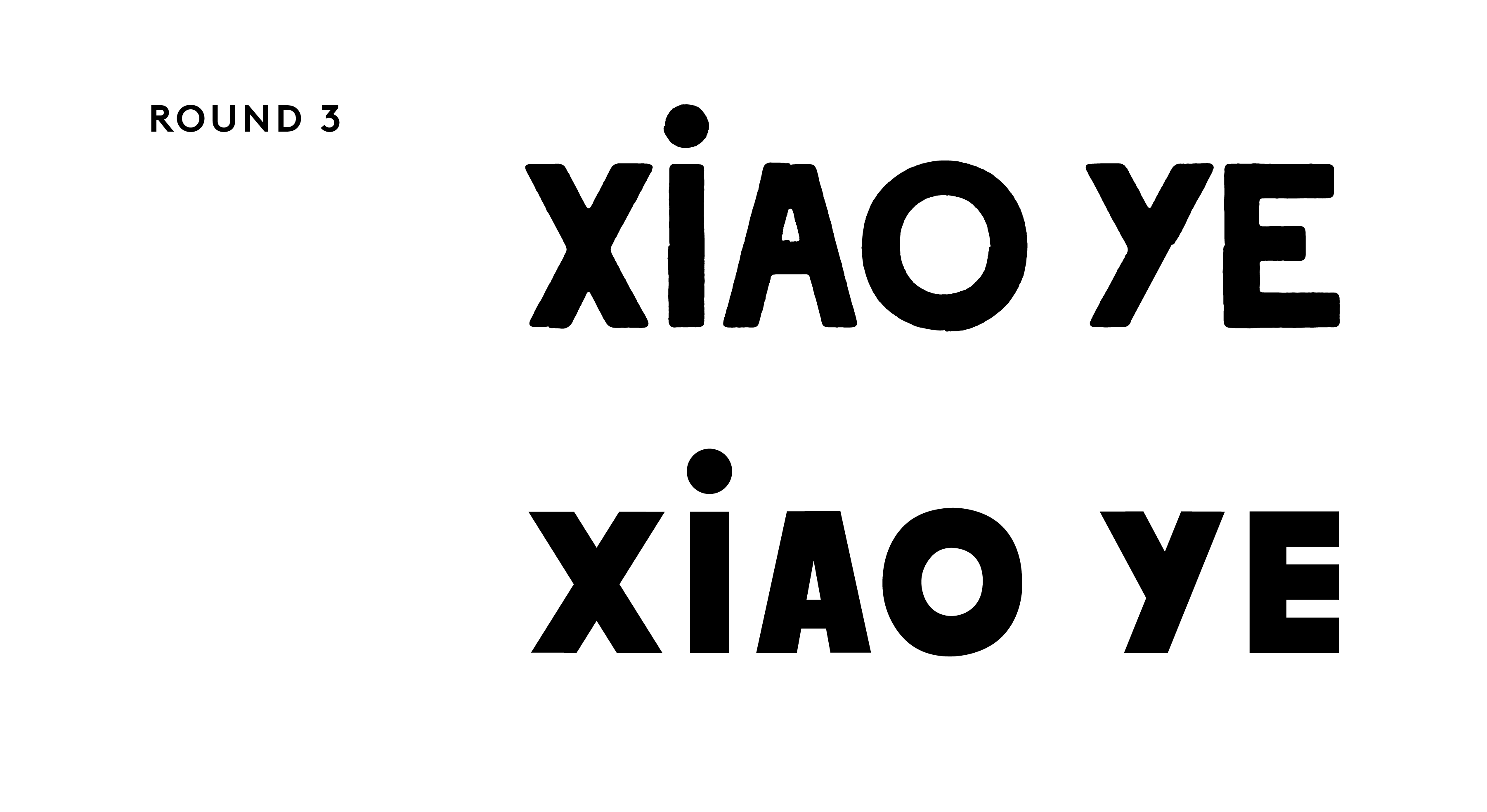
Round 3: To get us to that final 100%, I tried out a version that was redrawn based on a font that we had found online. By redrawing it, I mean that I recreated the letterforms with shapes and then tightened up the details from there. The bottom option in this section is our final logo, but you’ll see that we tried out a wider, more rounded version above that had a slight texture around the edges of the letterforms that ultimately didn’t make the cut. It felt more cute, but not quite as sophisticated.
How did you go about searching for our secondary fonts and finalizing our color palette?
The logo is designed to be the recognizable figurehead of the brand, and the typography and color palette are supportive elements. Most of the time, I try to nail down the logo before choosing secondary fonts and colors, which is actually what happened in this case. Once we settled on the logo, I went back to those key words we had discussed to find fonts that felt right. I pulled fonts from European type foundries hoping to bring some of that interior inspiration in through the typography as well. As for the color palette, we had started with a wide range of colors that I had pulled from Jolyn’s interior inspiration and selects and ended up narrowing down to just 2 secondary colors (aside from a cream and black). We originally loved a bright red, but that had immediately made the name feel too stereotypically Chinese, something that we were trying to move away from. We ended up going with a rich forest green, a color that feels timeless and elevated. We tacked on a mustard yellow from one of our first rounds of designs to really round out the identity — it was a color that kept coming back to us, especially in Jolyn’s inspirational imagery. It ended up being the missing piece of the puzzle!
How did working through the menu design and website help finalize elements in our branding?
As I’m working on a brand identity, my litmus test to see if these individual elements (logo, fonts, colors) work is to make a real application out of them. For a restaurant, designing a menu was the perfect application for testing out the identity. Once a menu was built out, we were able to see what elements were working or not and what seemed to be missing. Designing out a full website really helps figure out all the kinks of the identity and create an actual structure to work with. After we wrapped up the website (the most recent project we’ve done for XY!), I felt like we had finally completed the identity.


